Risograph Workshop at Loyal Supply
This weekend I participated in a 1 day Risograph workshop at Loyal’s Design Studio in Somerville, MA. Andrew Scripter of Wing Club Press in Portland, Maine and Ryan Habbyshaw of Loyal Supply Co. hosted the workshop. The workshop covered an introduction to risograph printing, basic training on an MZ1090 Riso Duplicator, and tutorials including how to prepare files, color separations, color mixing, and comp output options.
Bridging the gap between a conventional photocopier and laser printer, Risograph printing, aka Riso, is a simple yet brilliant tool for anyone interested in producing high quality prints on a shoestring budget.
We were all able to produce 2 editions of 25 - one single color and one multicolor for a total of 50 prints.

Intro & Prep
Andrew and Ryan shared the history of risograph printing and showed us Ryan’s printer.

Riso ink drums (yellow, red, and fluorescent pink)

Drums loaded with ink and masters

Ink drums (red, and fluorescent pink) loaded in to the Riso machine
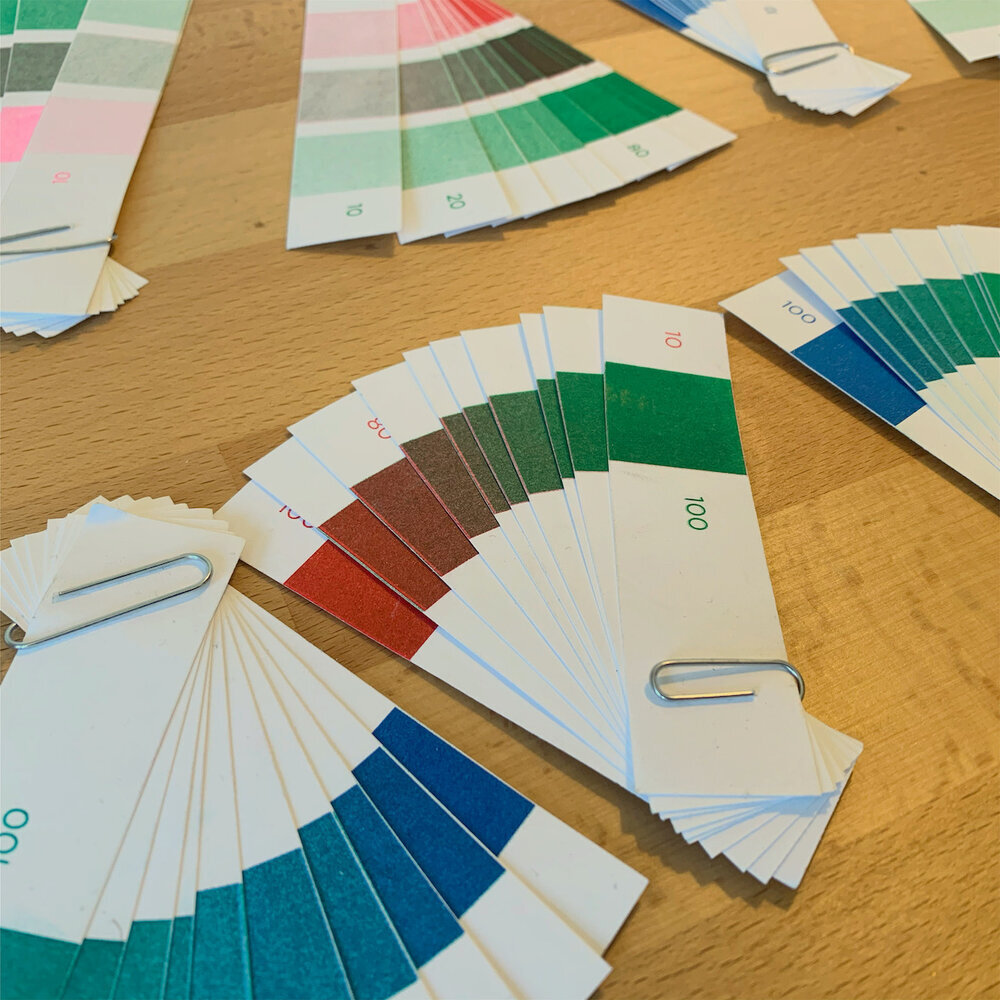
Color and saturation swatches for the inks


First Pass: 1 Color
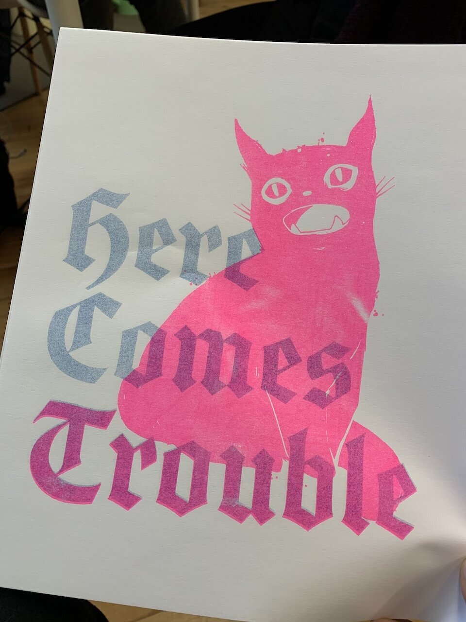
Our first pass was a 1 color run. No one else was opting to use fluorescent pink for their prints; so I went for. It’s one of those signature riso colors, so I wanted to be able to use it. I did a 2-up print using a couple of photos of mine from a past ICA exhibit.

1 color run in fluorescent pink

Close-up of riso print
First attempt. The blue was coming out too light, so we made a second master for the blue run for it so it would come out darker.
First attempt. The blue was coming out too light, so we made a second master for the blue run for it so it would come out darker.
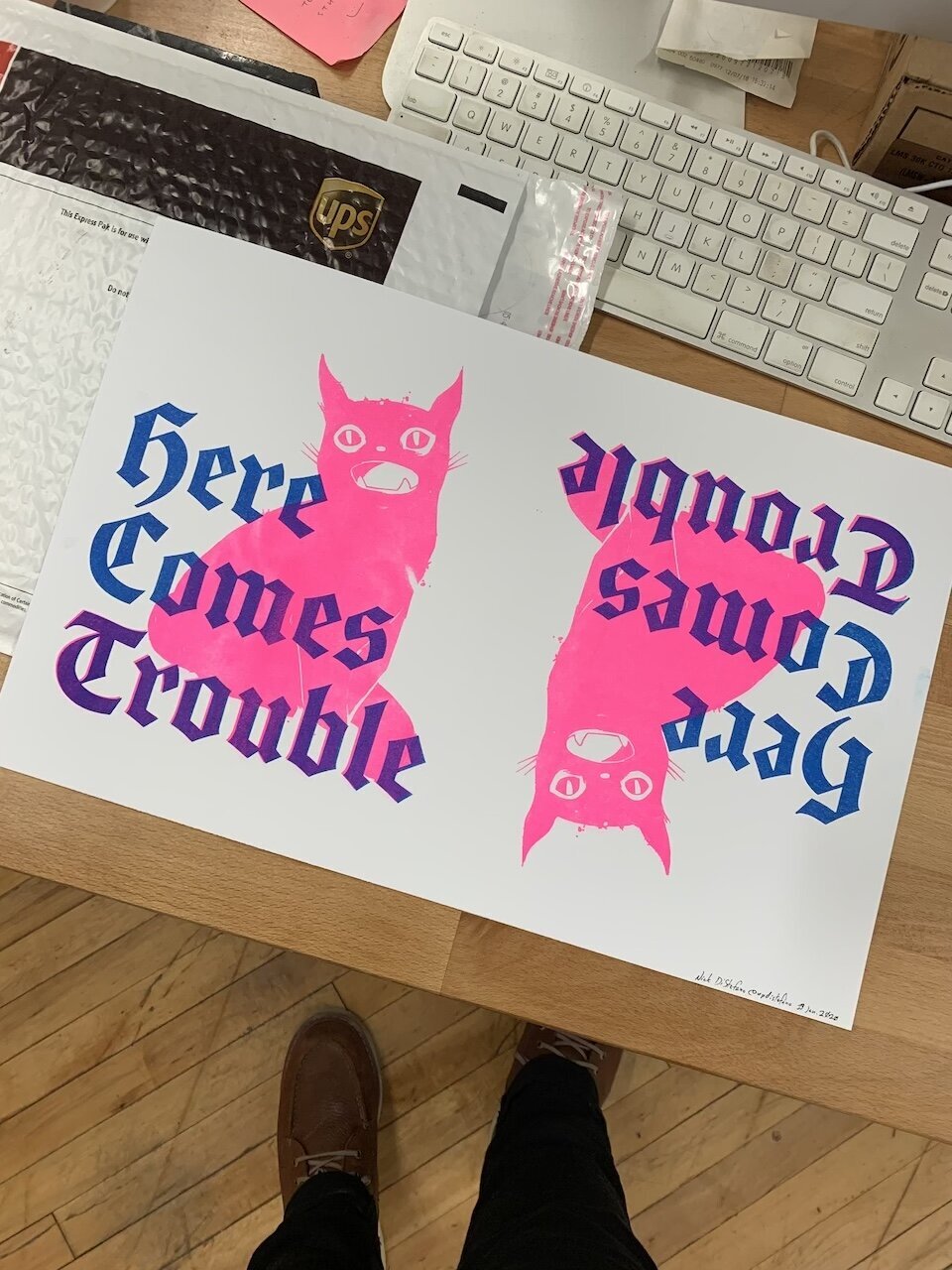
Finished sheet after both runs. I sized the images to get 2-up on each sheet.
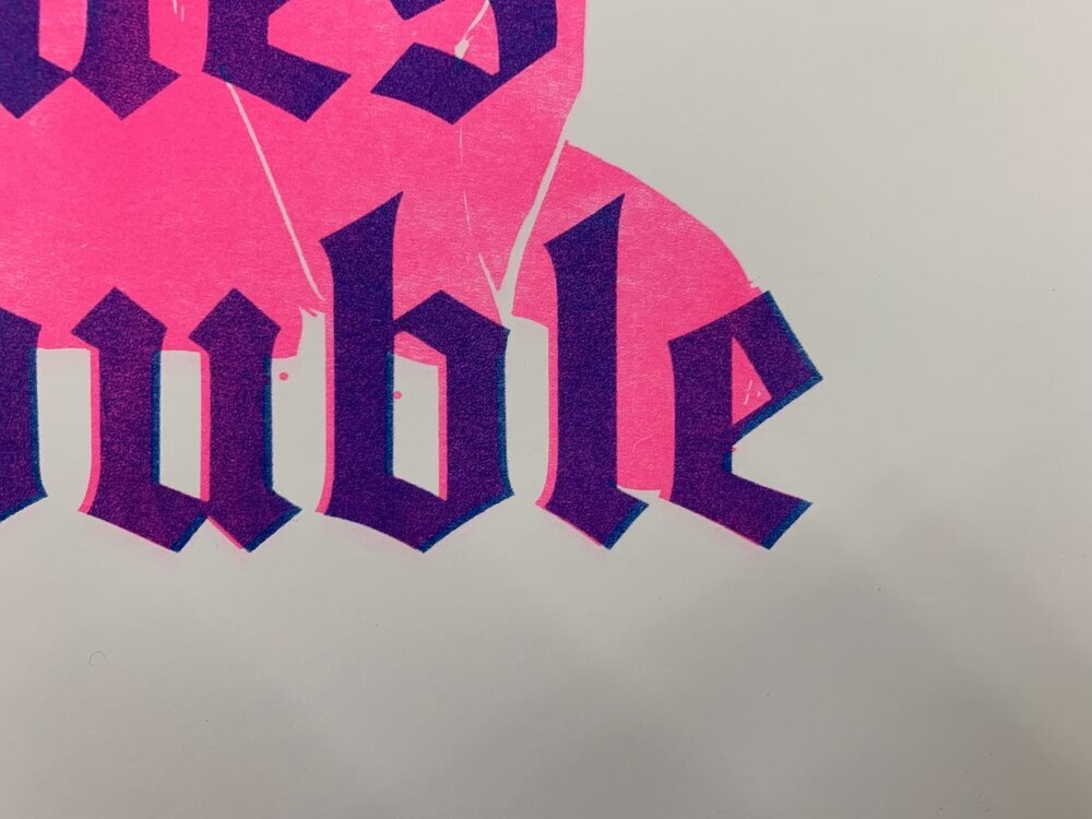
Close-up of Trouble: Got a bit of a shadow effect with the positioning of the two layers.
Surprise Collab
The person after me decided to also use fluorescent pink on his run, but they hadn’t made a new master for his design, so when they printed my pink master was used.

Surprise over-prints
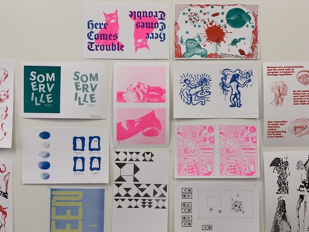
Everyone’s prints posted up in the studio.